

Approximately 15 minutes read
January 2023- Current
Project overview and goal
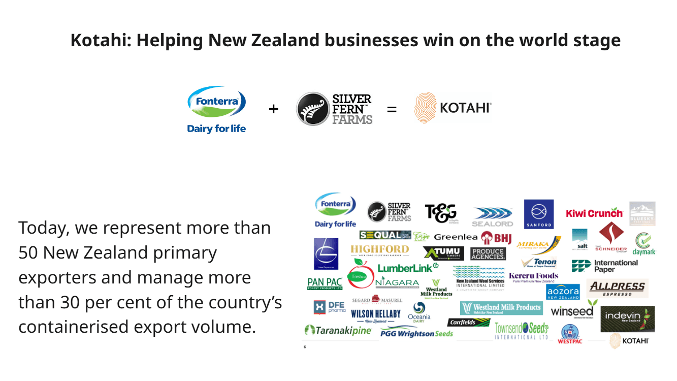
This program is part of a wider business transformation that involves re-energising Kotahi. To reshape the way Kotahi delivers value to it's customers. The goal was make sure the tools, systems and processes are future-proofed and AI ready. The impact of the program will impact more than 50 New Zealand primary exporters who managed 30% of countries containerised export volume.
My role and the wider team
I worked as the lead UX/UI in the project team alongside with the PM, Scrum master, Senior BA, Front end devs, backend devs, Data and Insights team, Architects and key subject matter experts.
Programme Impact
Voyager is a critical enabler of Kotahi's strategy- supporting New Zealand exporters to succeed globally and enabling future froth through it's network and Go-to Market strategies
About the Organisation
Largest market share (approximately 30%) in containerised exporting volume in New Zealand
Subsidiary of Fonterra and Silver Fern Farms
Organisation's big vision
Design Process
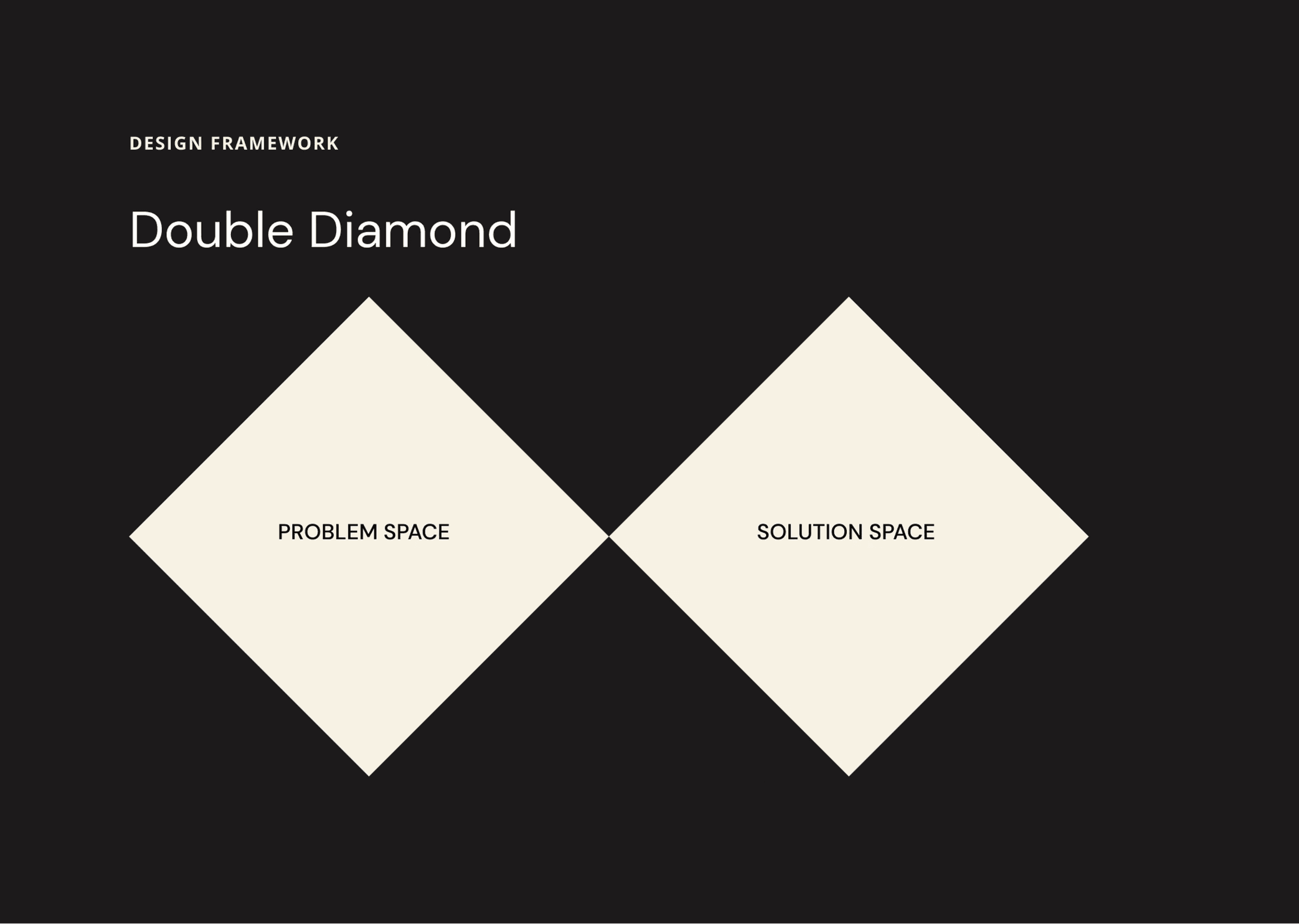
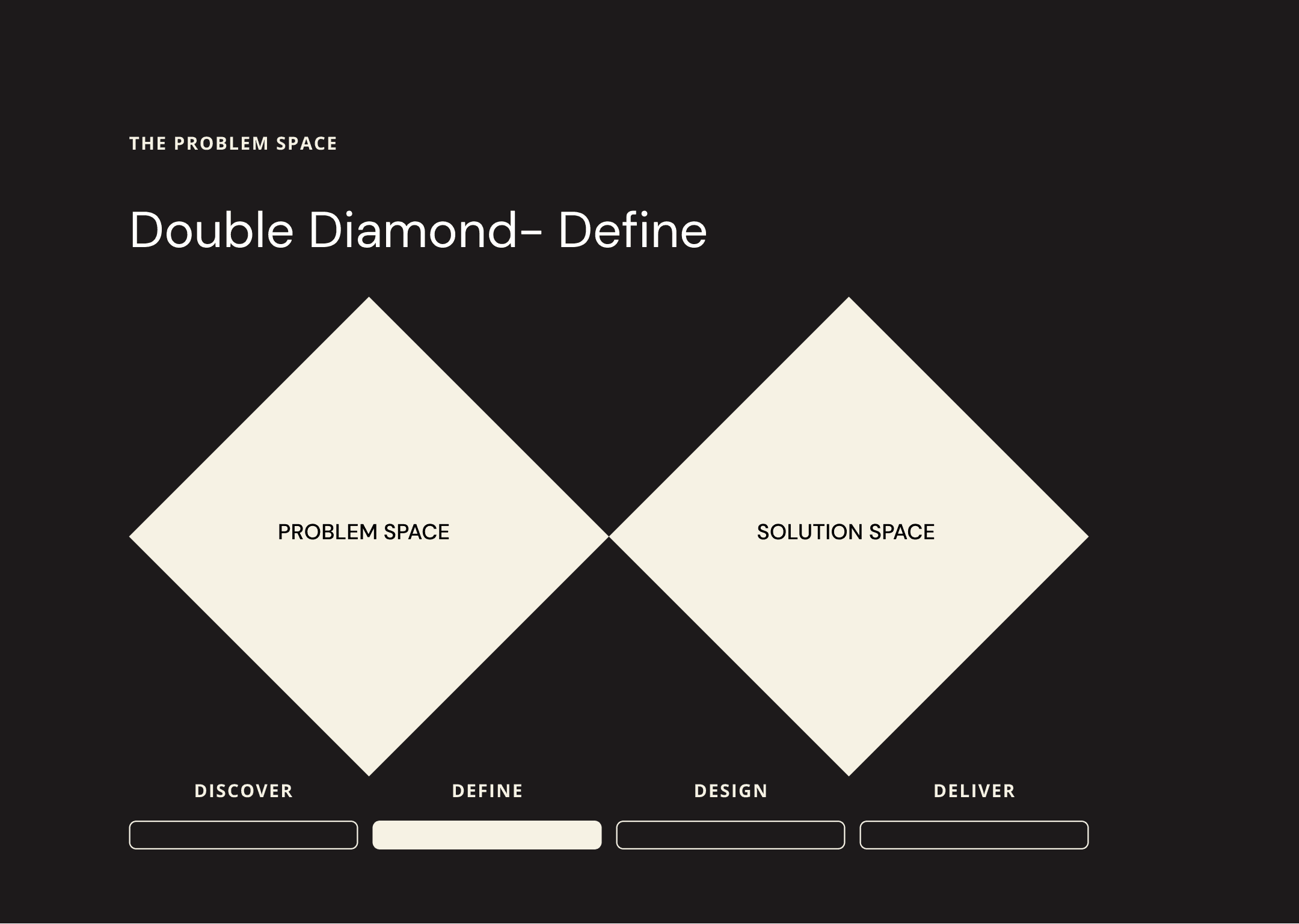
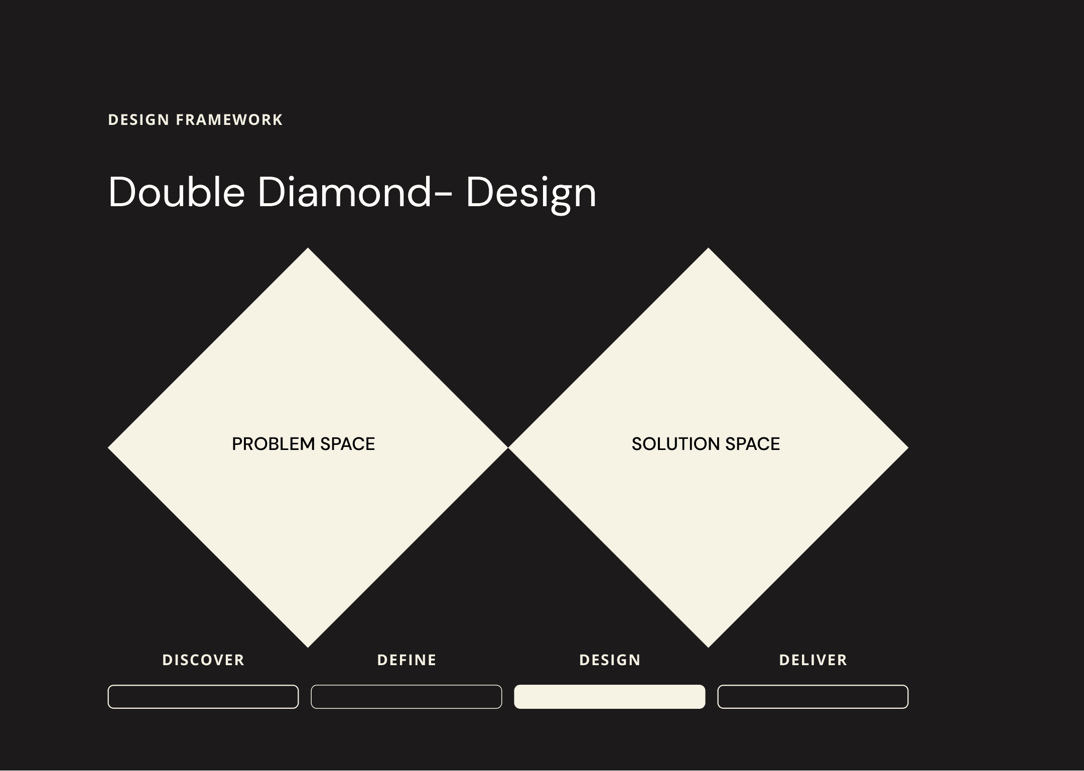
The agency adopted the agile working model to achieve our project goal. We followed the double diamond framework Discover, Define, Design and Deliver
Discovery phase
Qualitative research
A series of interviews and focused group sessions were conducted with the users to gain the requirements for the project. After a series of talk we were able to extract the requirements and have them documented on the confluence.

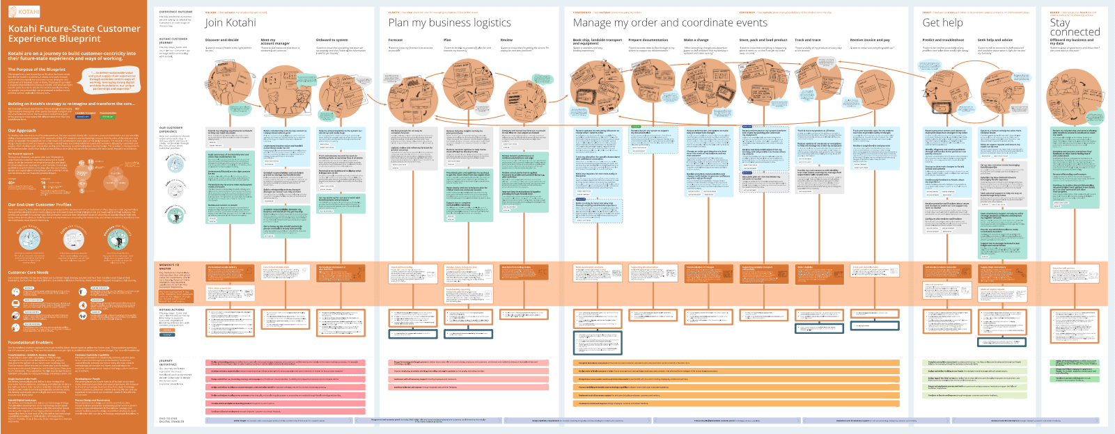
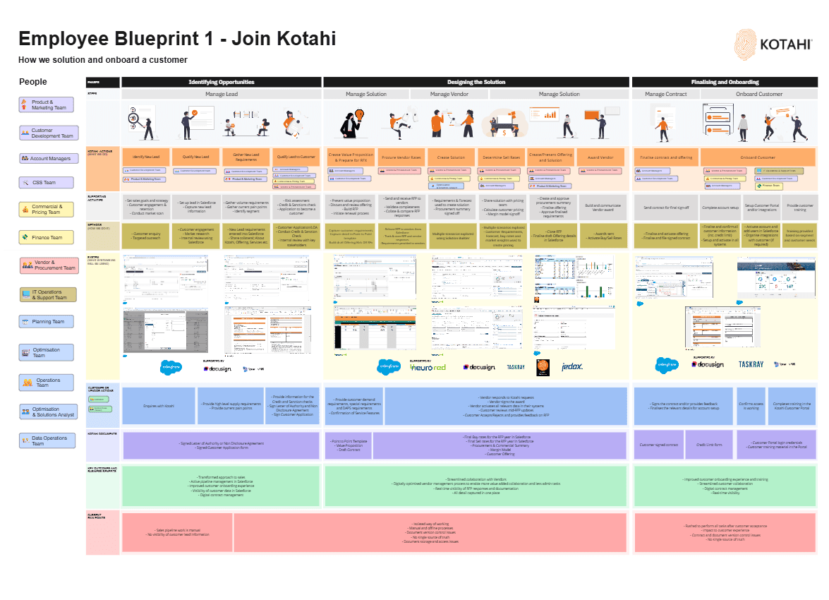
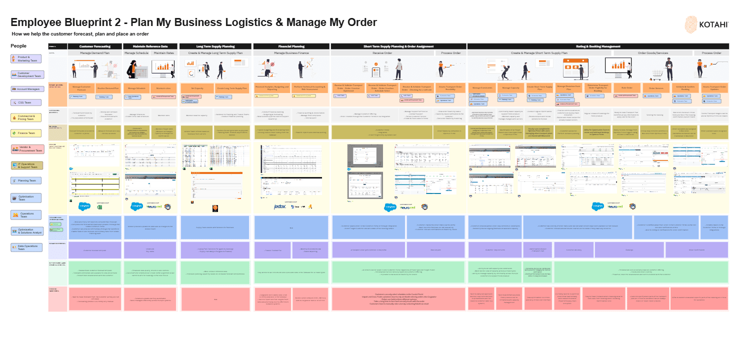
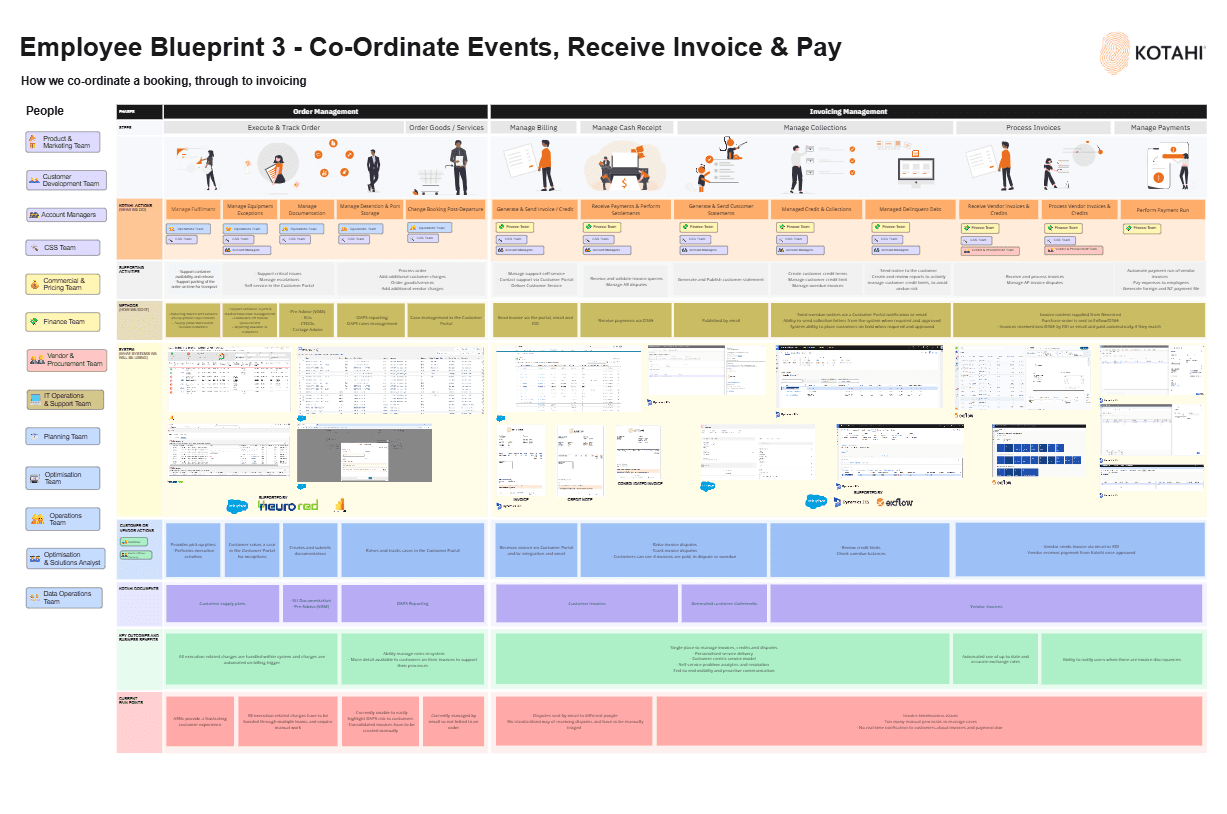
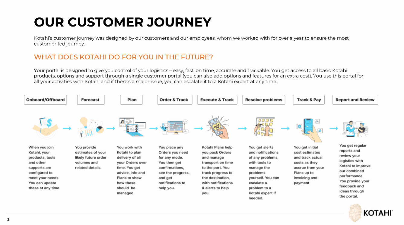
Kotahi Customer Journey Lifecycle Blueprint
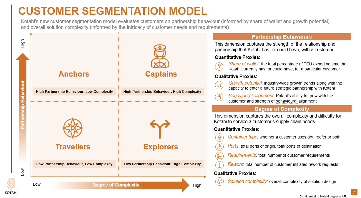
Customer Segmentation Model
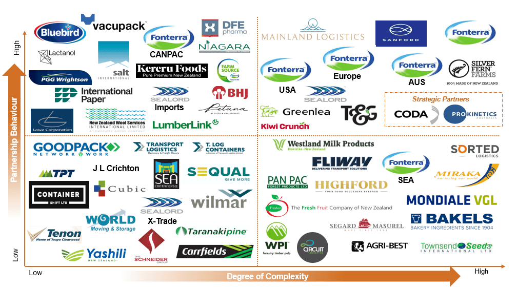
Kotahi Customers
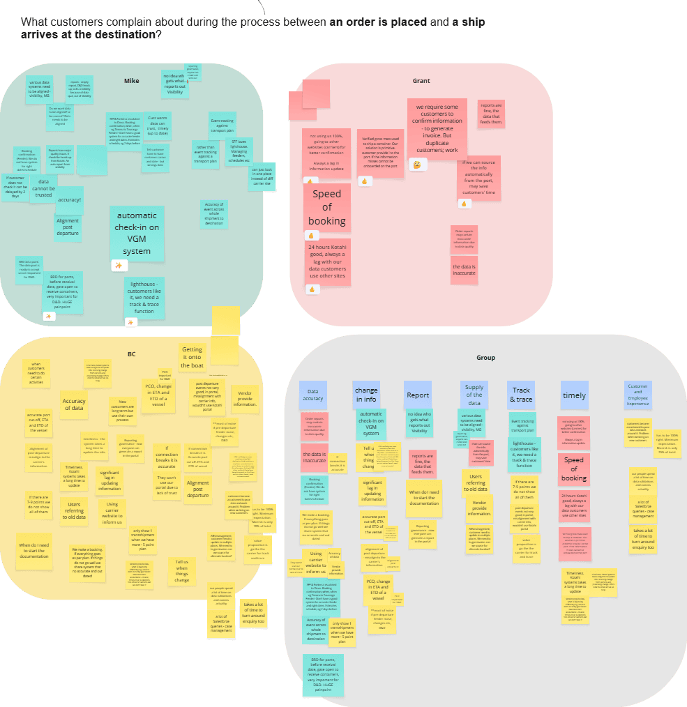
Current Pain points
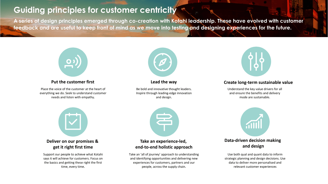
Guiding Principles
Vendor Partner Portal IA
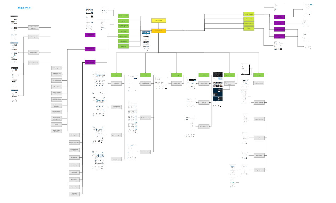
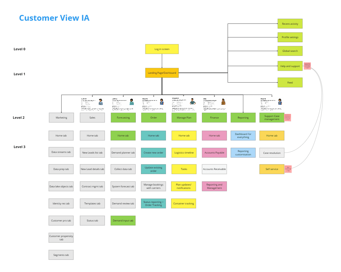
Customer Facing Portal IA
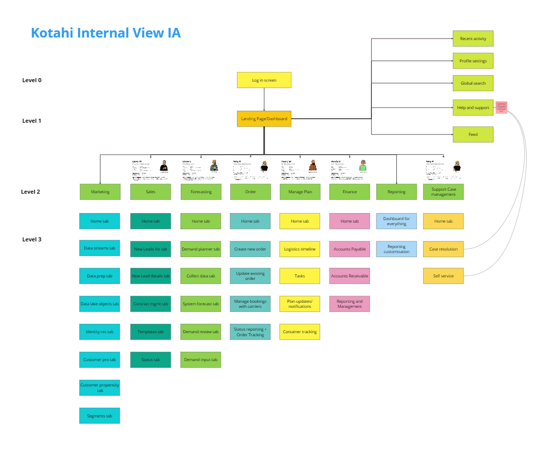
Kotahi Internal Users Portal IA
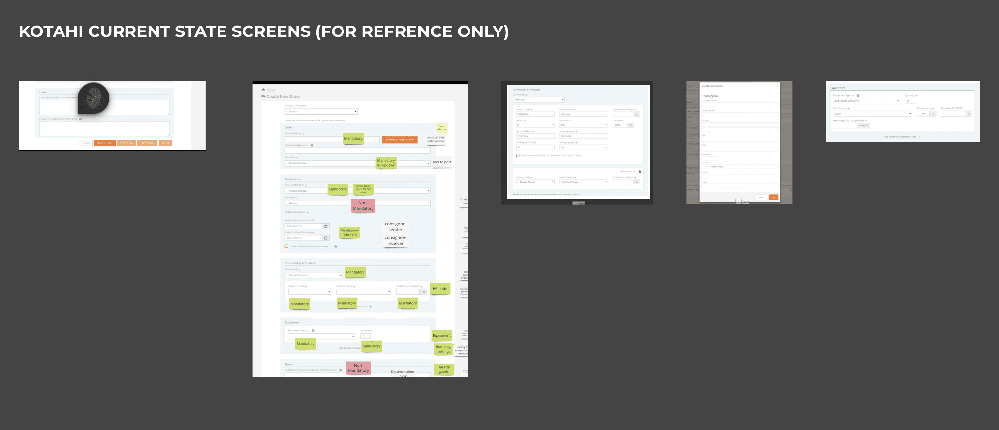
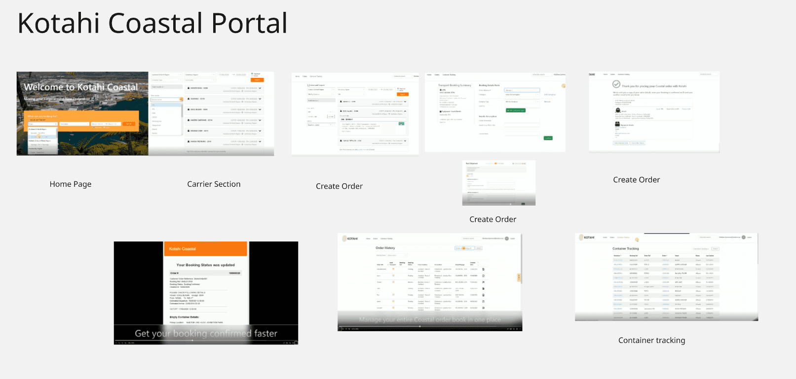
How things works currently (Existing Systems)
In summary, there are multiple systems that makes the process quite manual.
Export Portal:- New Zealand > World
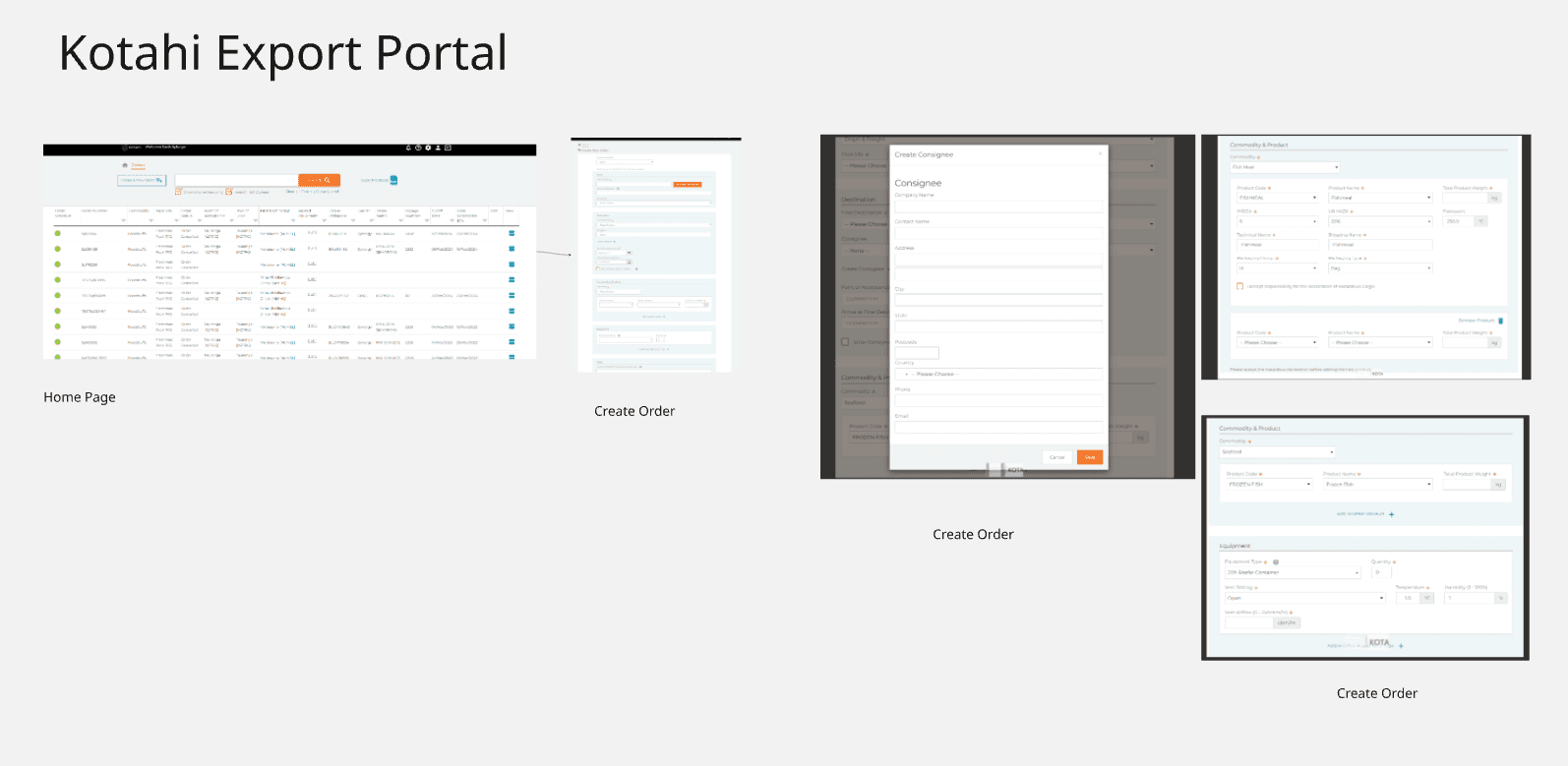
Create Order Form the biggest pain point
Costal Portal:- New Zealand > New Zealand
Define phase
UX Challenge
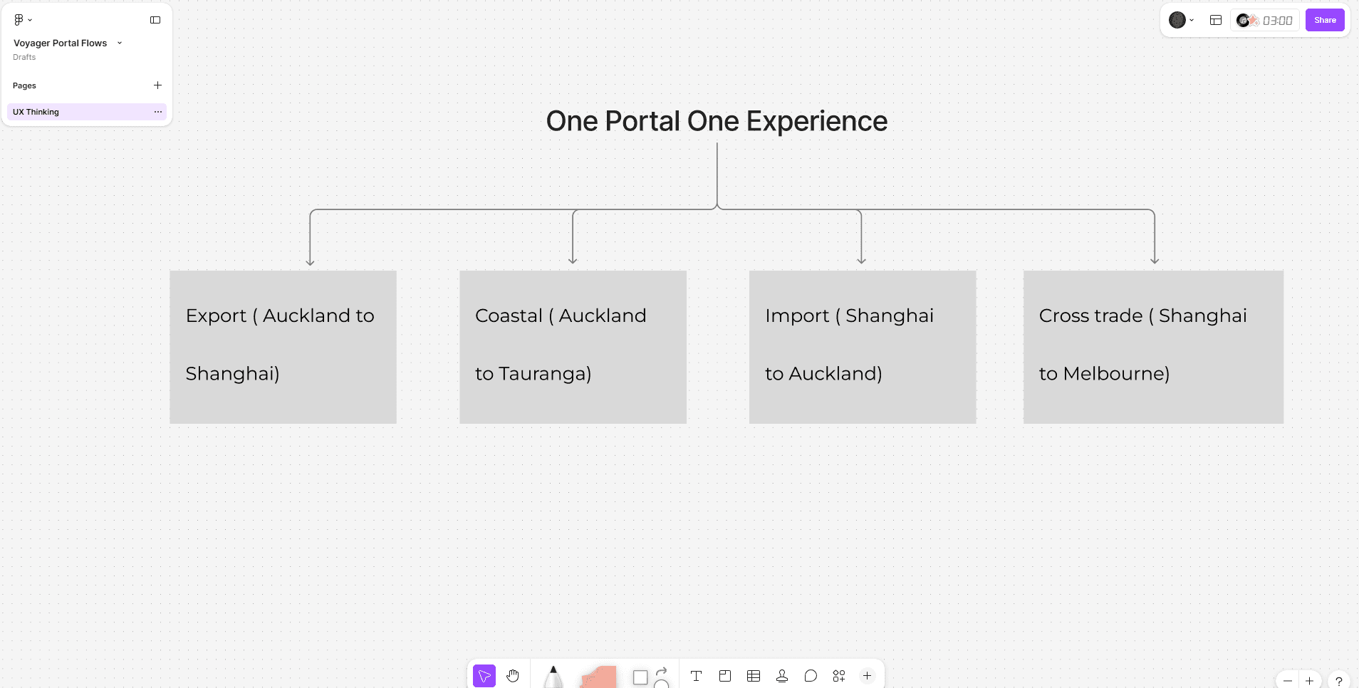
How might we consolidate 27 systems into a unified data architecture and collapse 4 customer portals into one coherent experience without disrupting live operations or losing the nuance each legacy system carried?
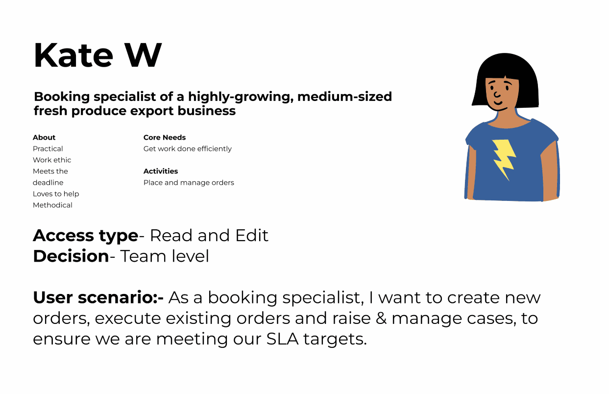
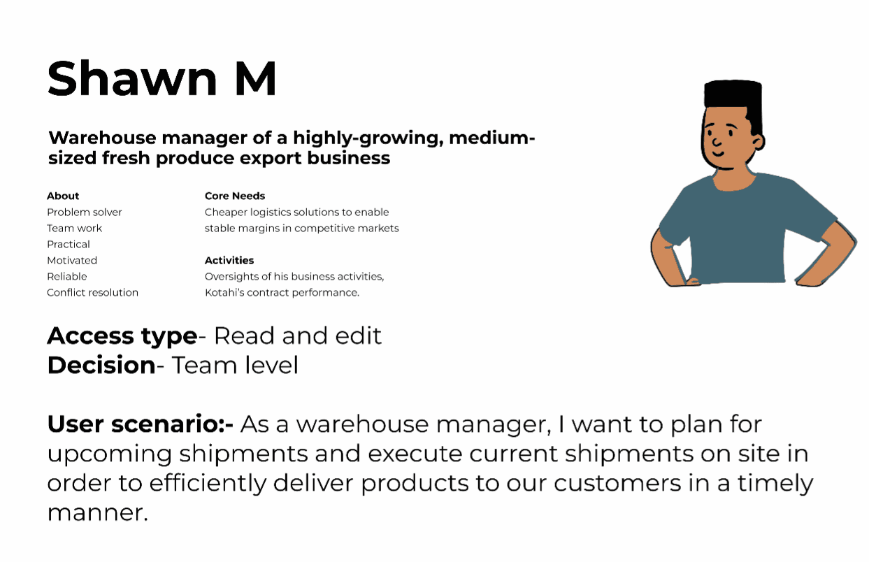
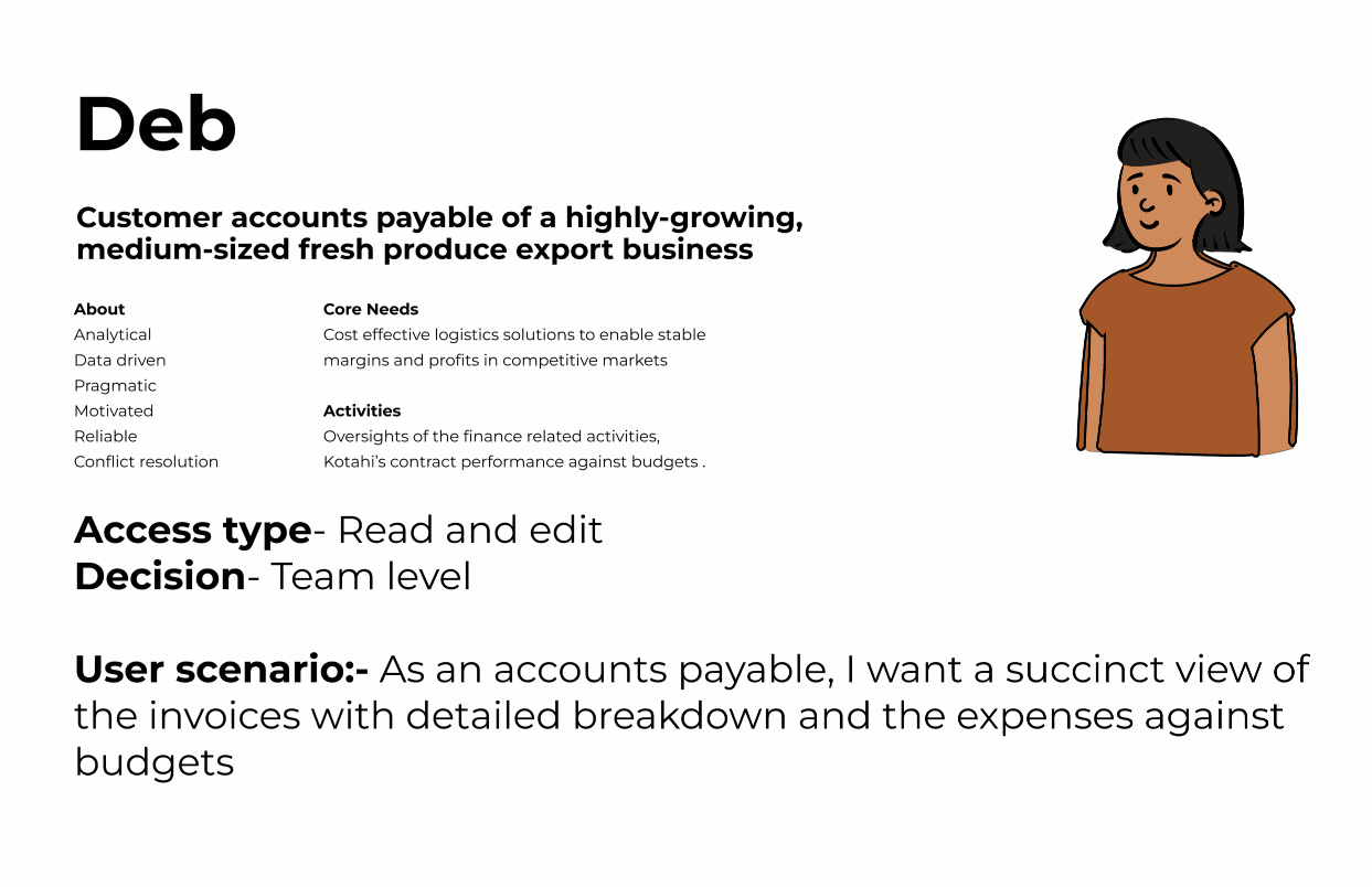
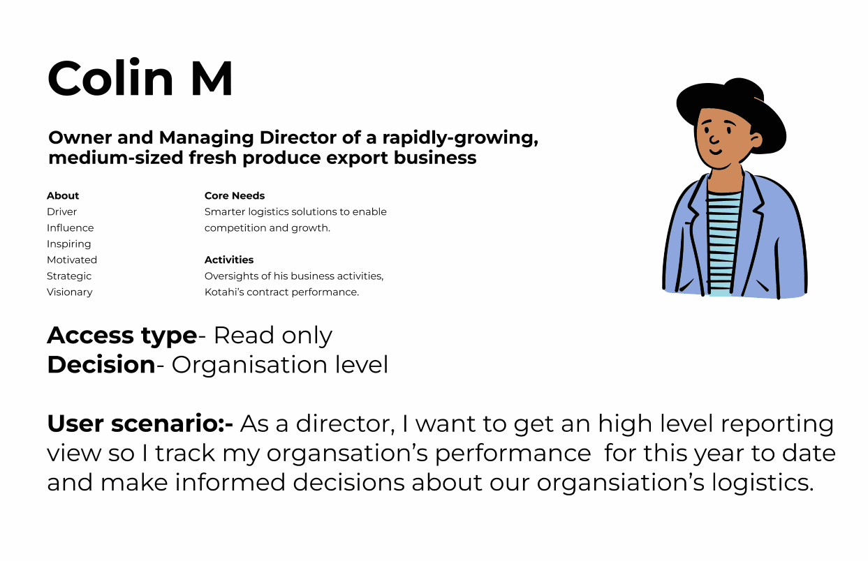
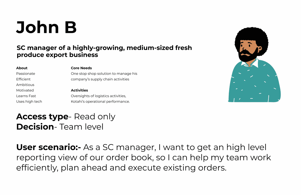
Understanding the user type and persona
Primary Users
Secondary Users
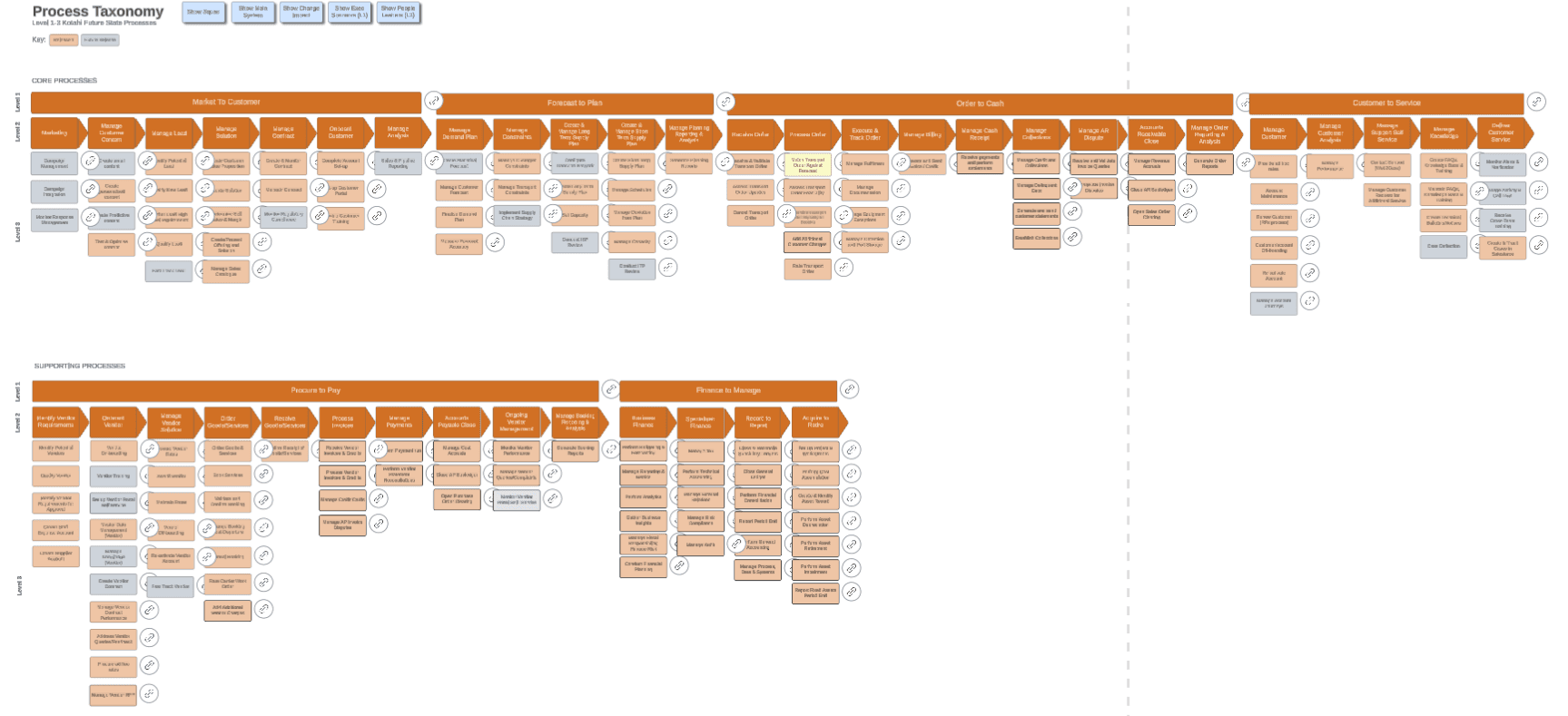
Business Process Taxonomy
Design phase
UX Challenge
How might we consolidate 27 systems into a unified data architecture and collapse 4 customer portals into one coherent experience without disrupting live operations or losing the nuance each legacy system carried?
Translating Low Fidelity Wireframes to Prototypes
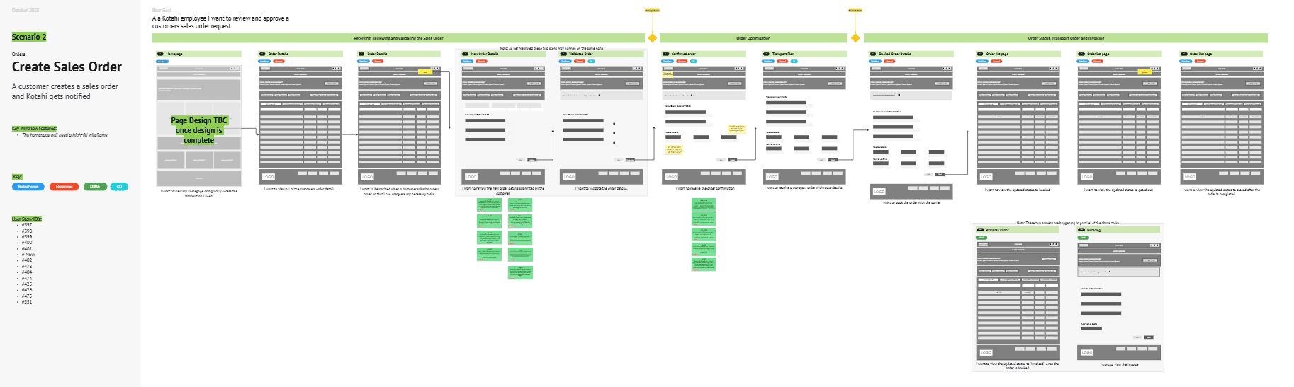
UX Brainstorming the E2E flow
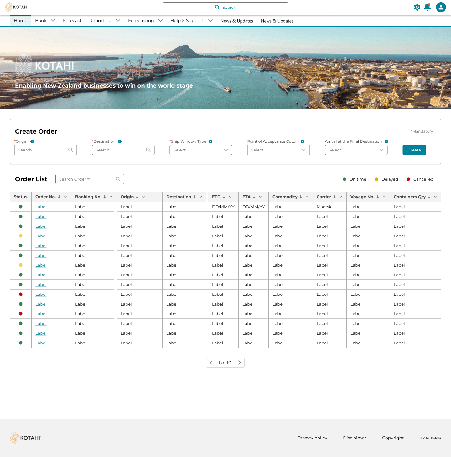
The landing page is designed to be operational and useful. Based on the user research I discovered the primary jobs to be done were 'Create New Order' and Monitor their current orders
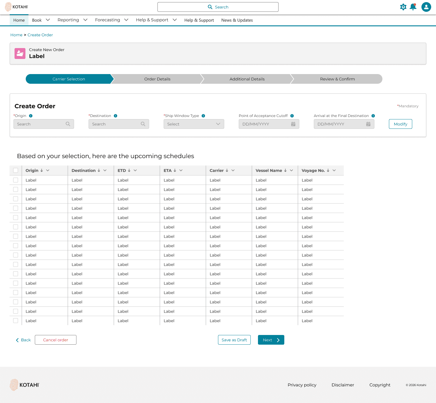
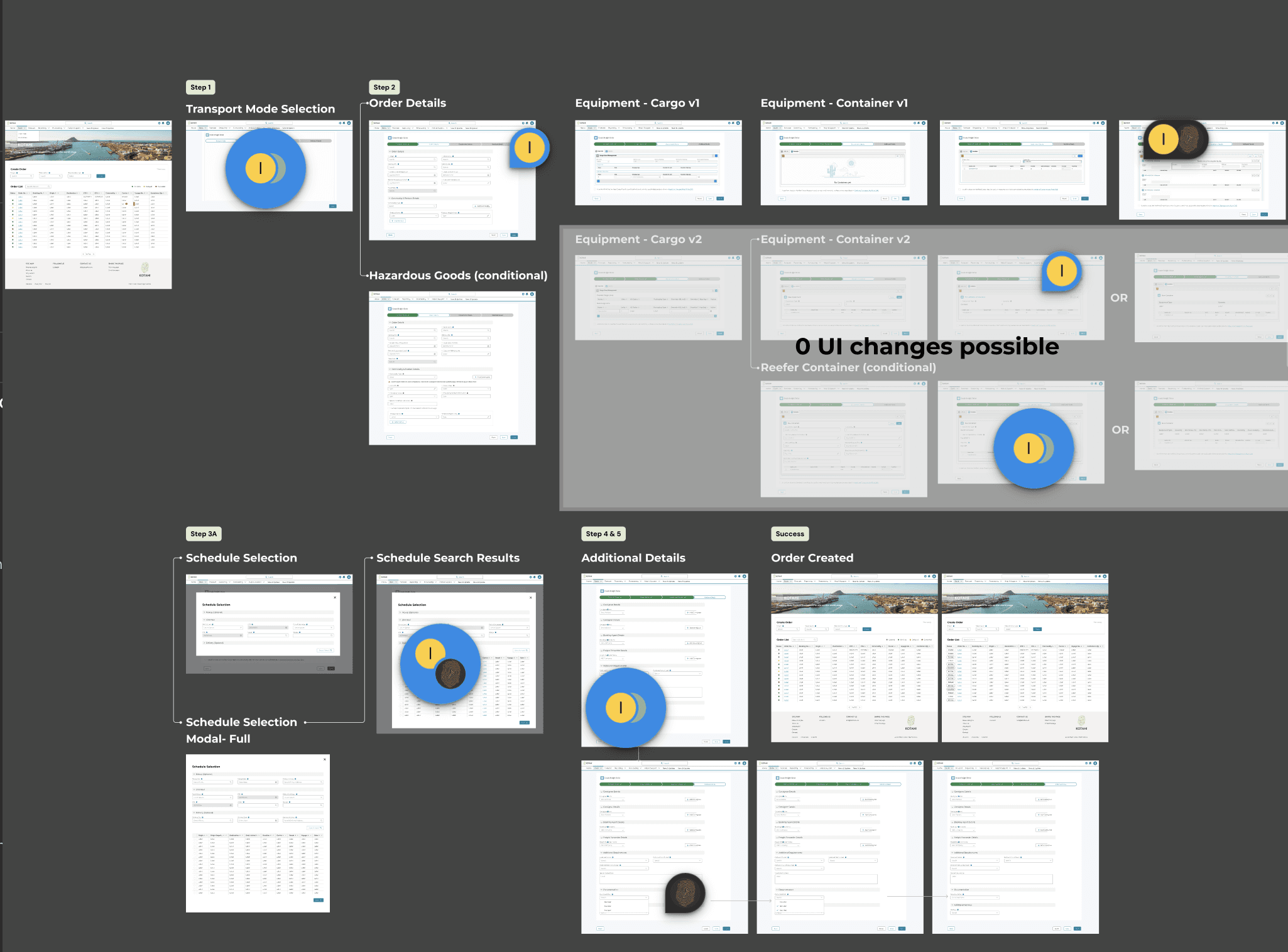
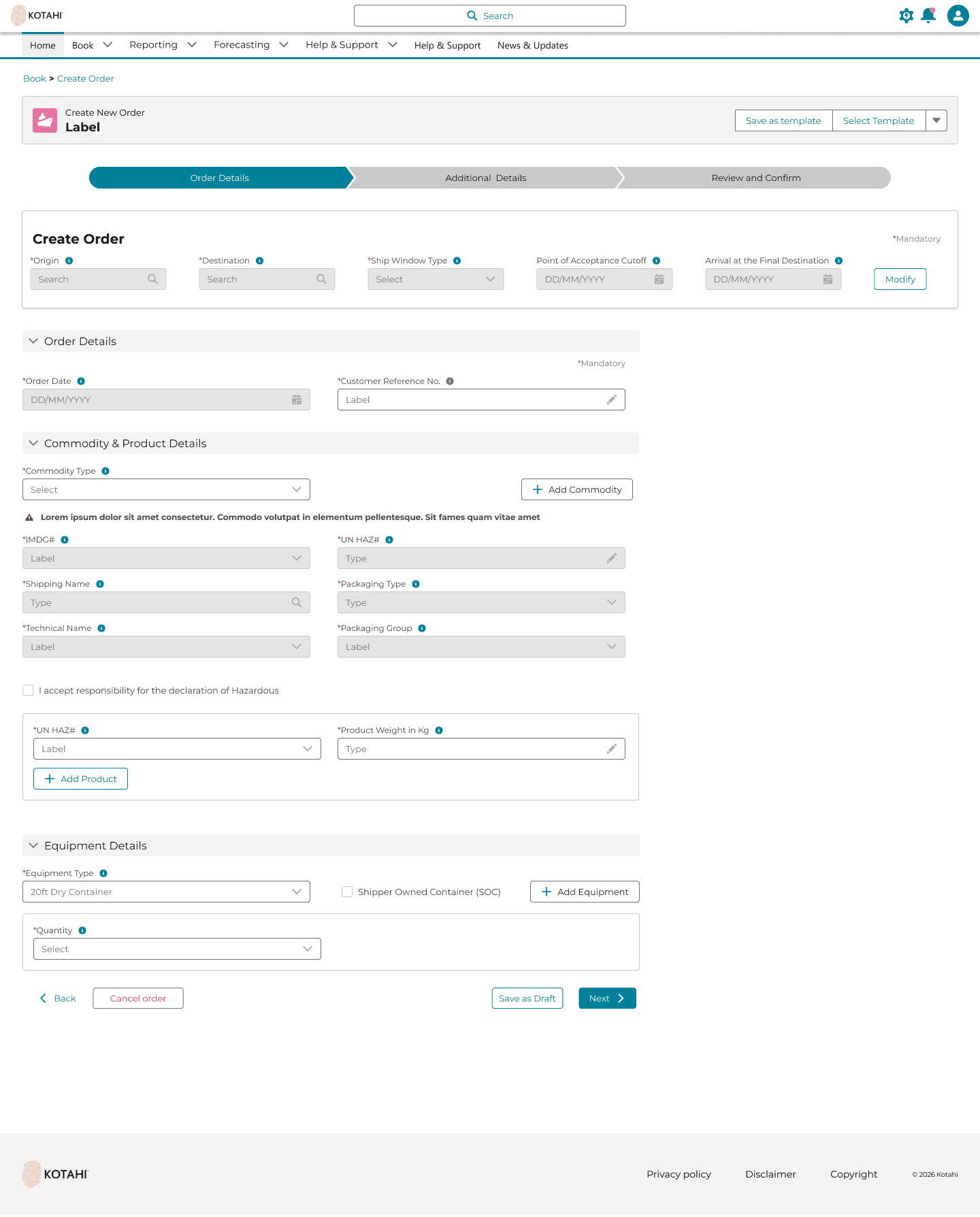
Create Order Form;
The UI challenge was different field requirement based on the product type.
Eg. Certain goods were classified as hazardous which requires extra UI fields compared non hazardous goods. The solution for this for creating sequential input based UI depending upon the product selection.
Default 'Create Order' form state.
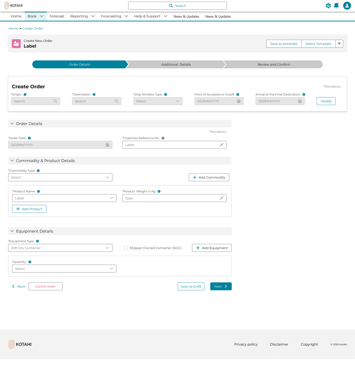
Logic one:- When the goods selected as classified as hazardous as per Digital Container Shipping Association (DCSA) standards
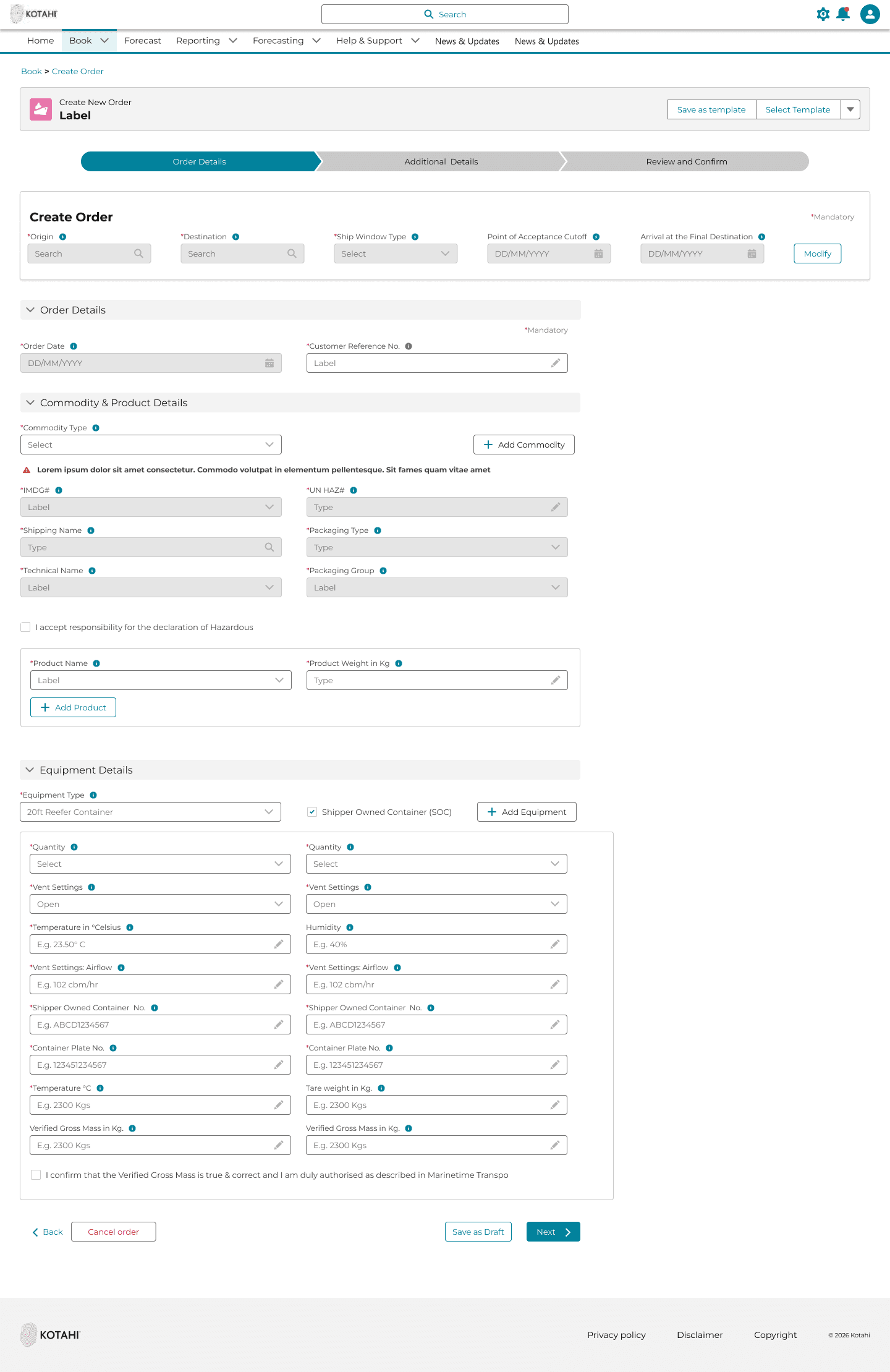
Logic two:-
When a user would select 'Reefer container' along with having their own container. The system would identify the logic and sequentially display the UI fields. This approach led to problem solving the current state pain point of having just one long form for all the customers.
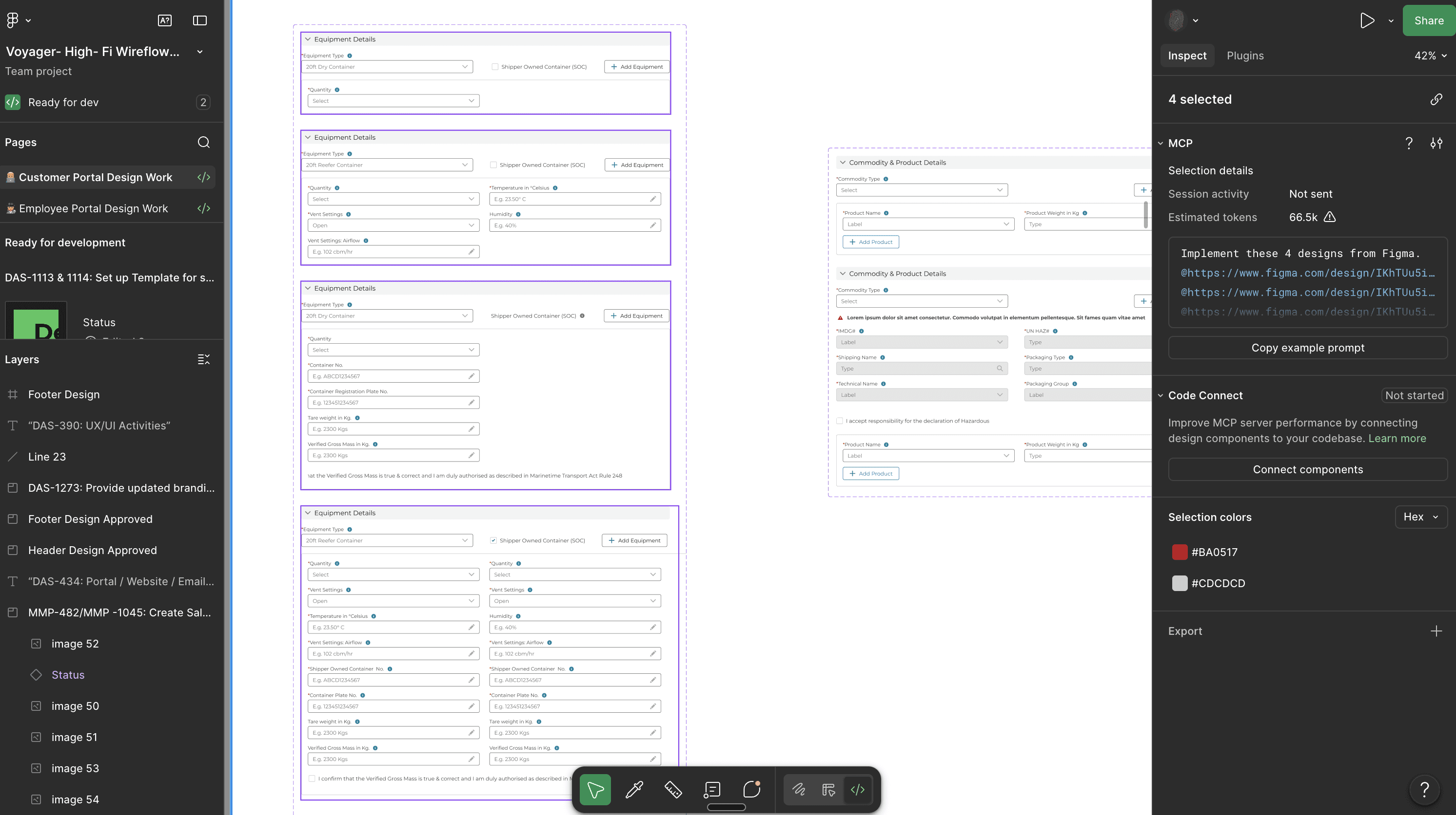
From a Design File hygiene perspective the whole form logic building using variants for single source of truth and effective hand off to the devs
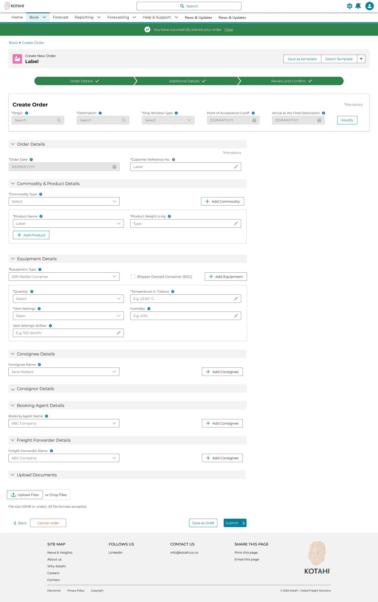
Additional Details (Step 2)

Review and Confirm
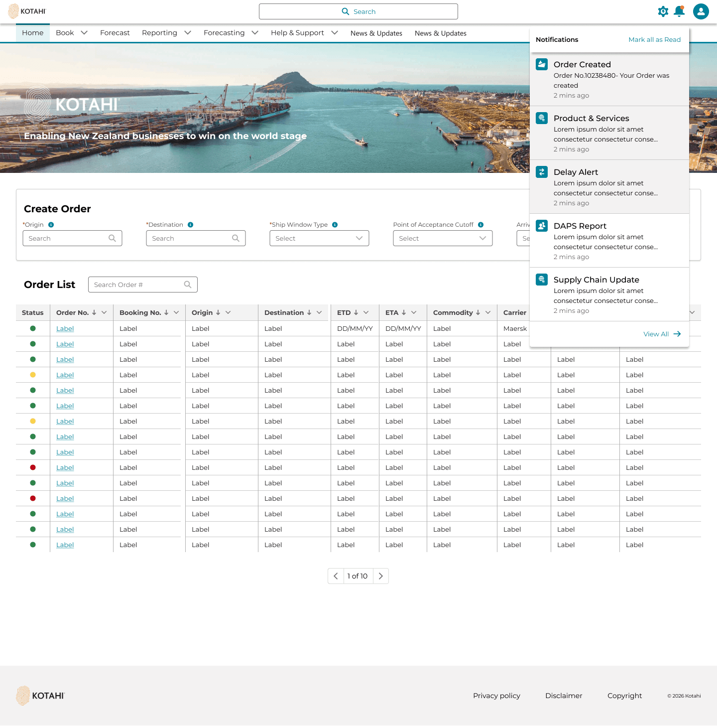
Notification framework;
In the current state the users were getting manual emails. This problem was solved using the notification framework
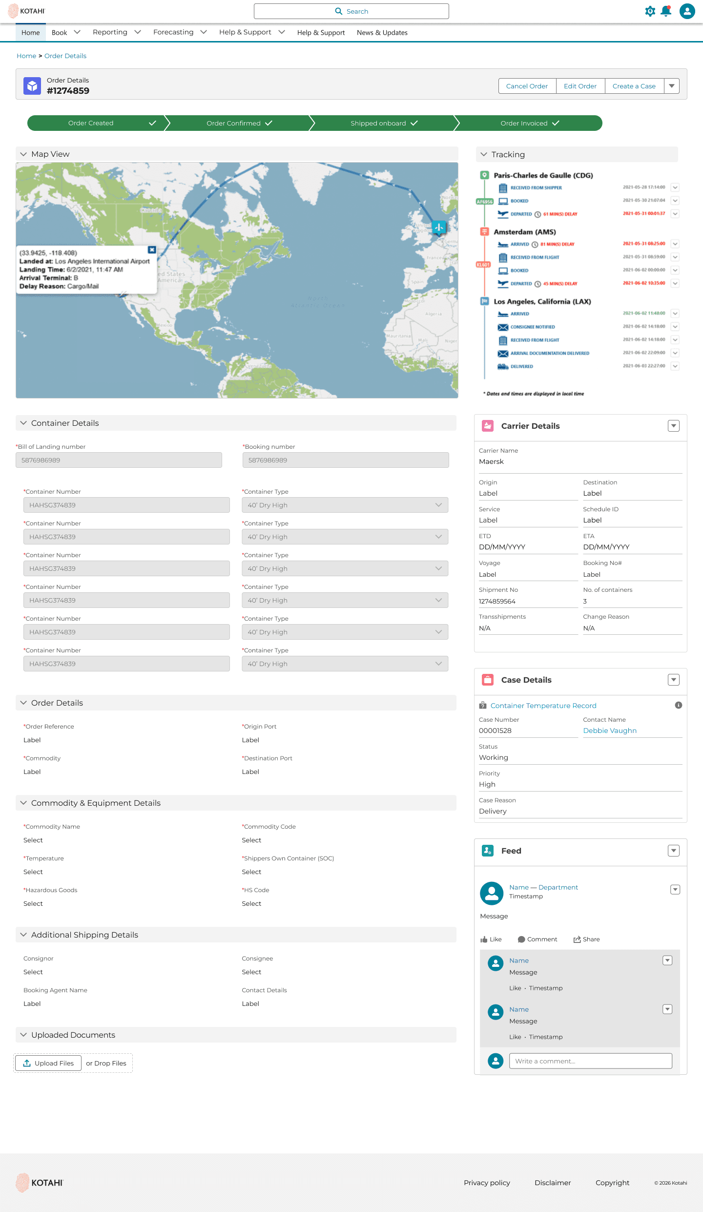
View Order Screen UI (Big Win for the customers and Kotahi)
The problem this screen solves is the user's major pain point of not having visibility of their orders. Having control and visibility reduced the inquires we were getting by 50%
Major events and disruption alerts.
In the current state this would be communicated via emails and users would miss out on the info. Having this feature in the portal made it easier for our users.
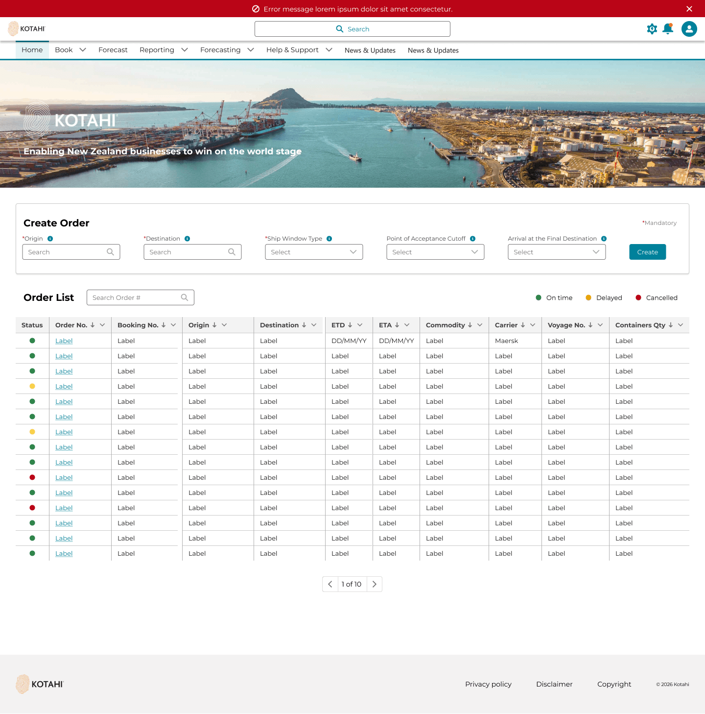
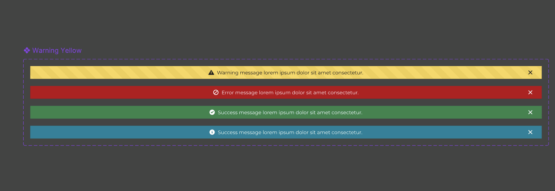
Applying conditional logic and using the different banner state for different scenarios
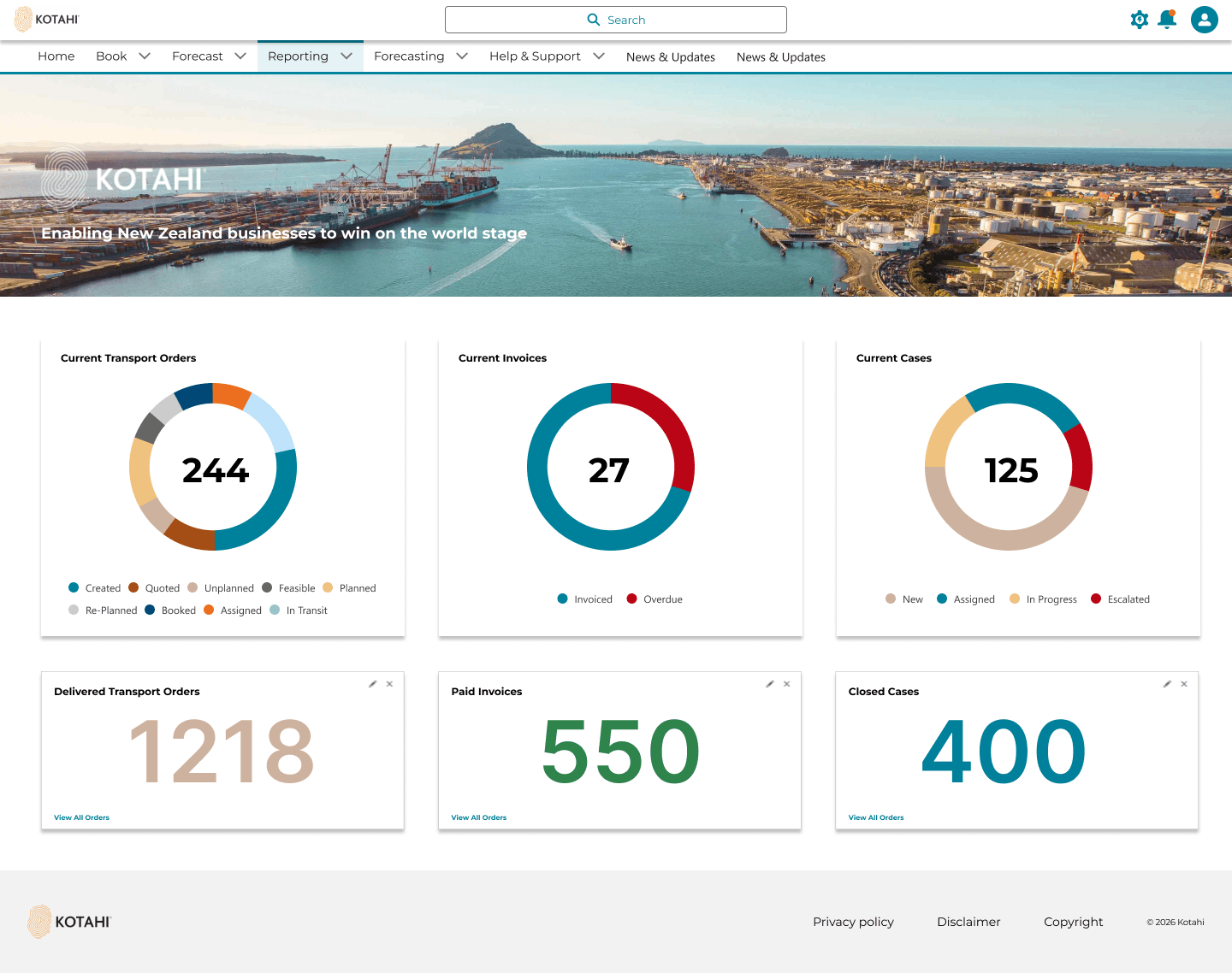
Reporting feature
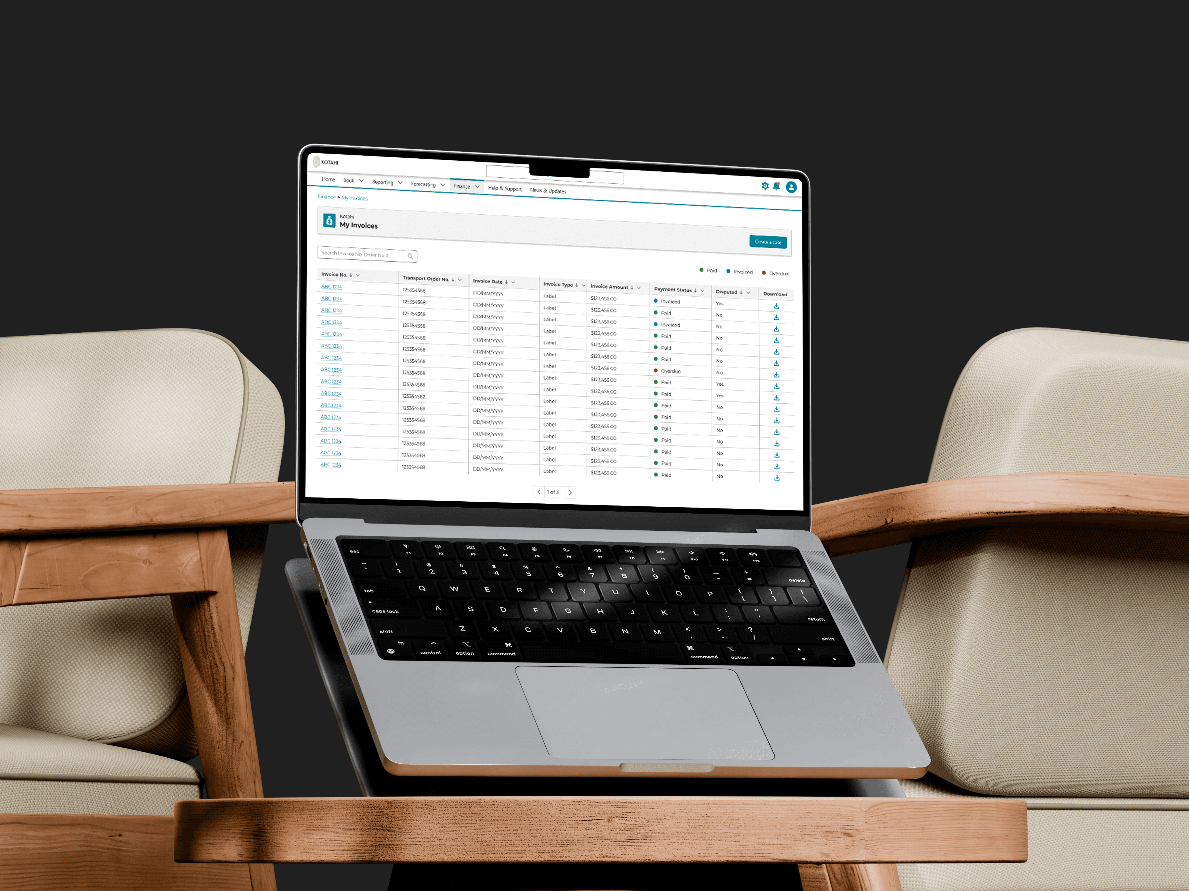
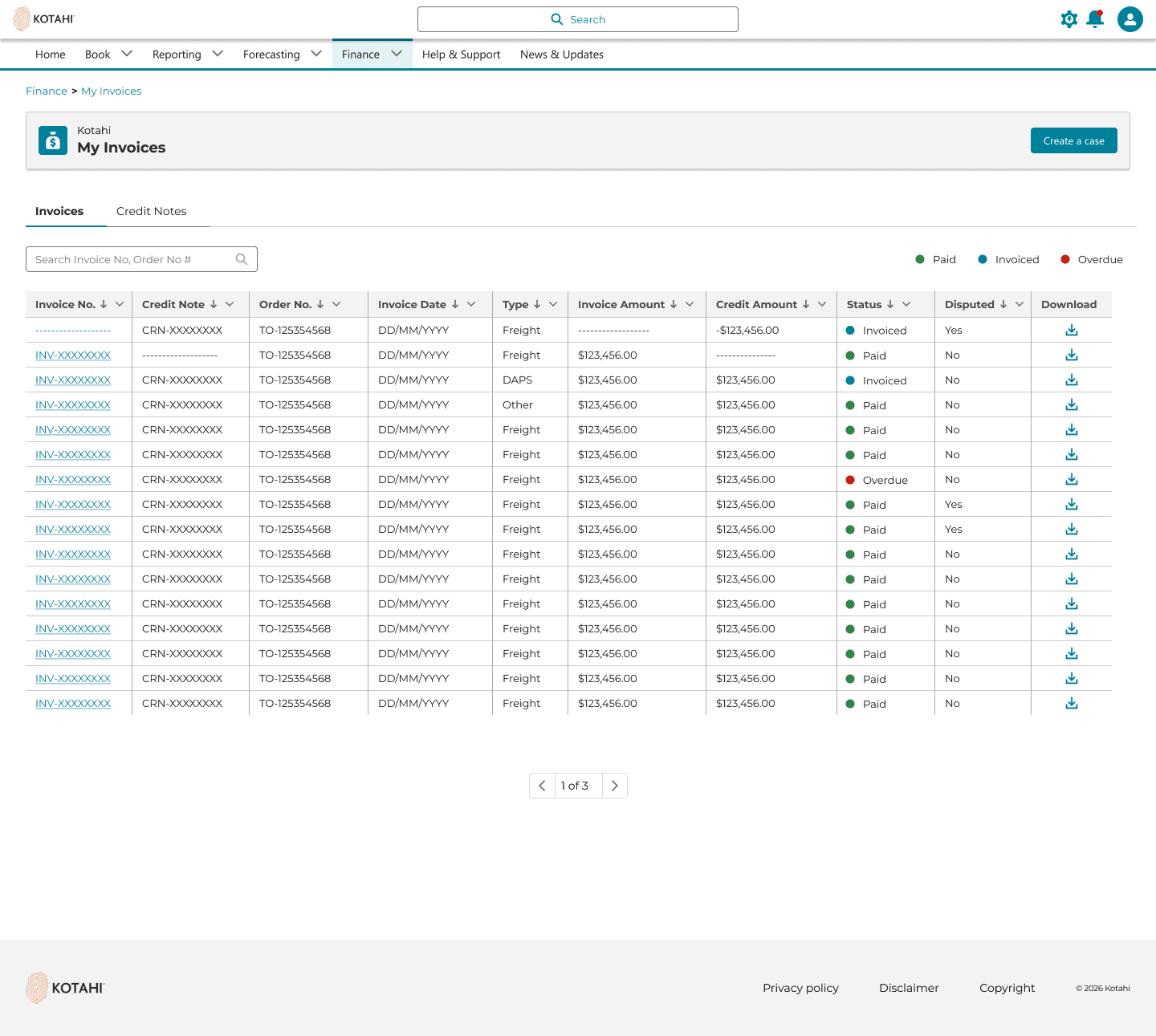
Invoicing Feature
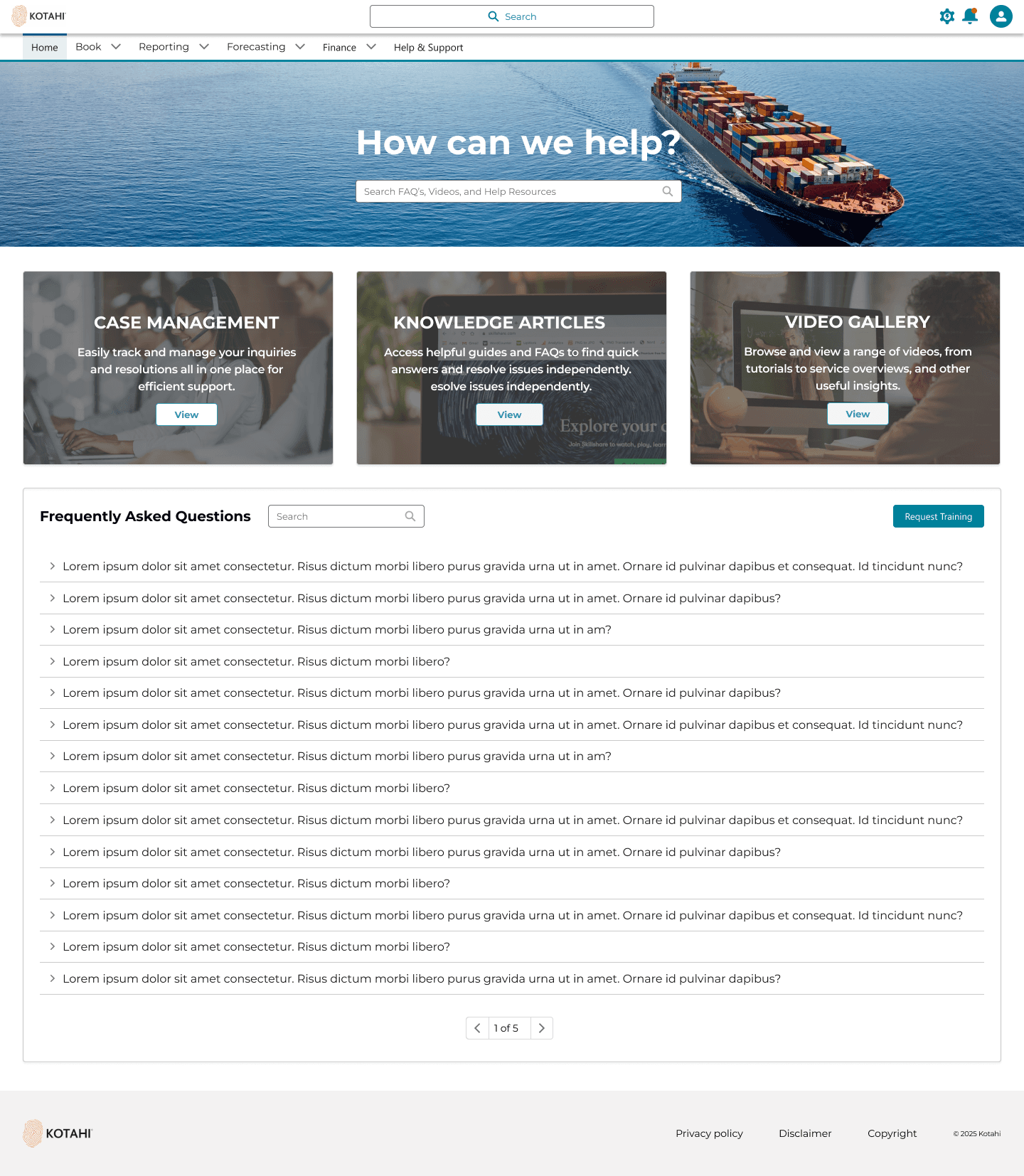
Help & Support Feature
Customer Portal
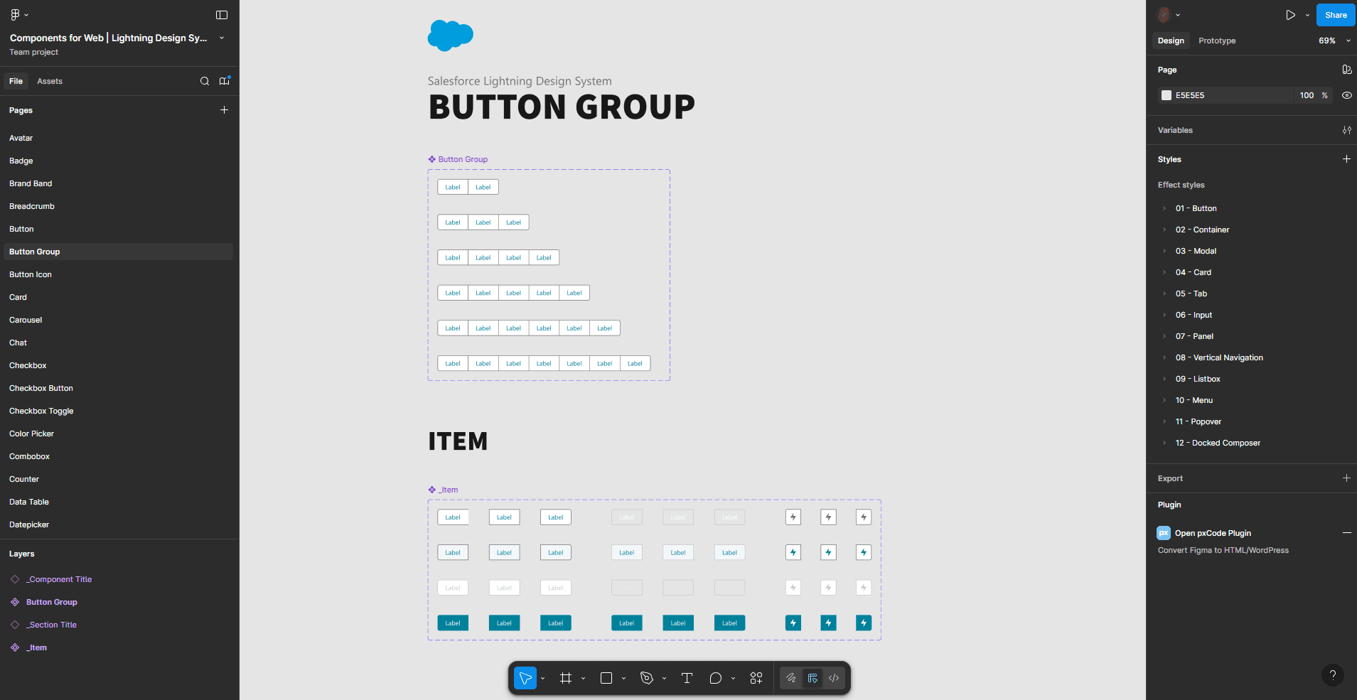
Kotahi Design System (Salesforce Based)
Working on the Voyager software helped me set up Kotahi's first design system. This was a collaborative effort shared between two designers. The design system was developed by following best practices from Salesforce design whilst maintaining Kotahi's brand guidelines.
Component Gallery
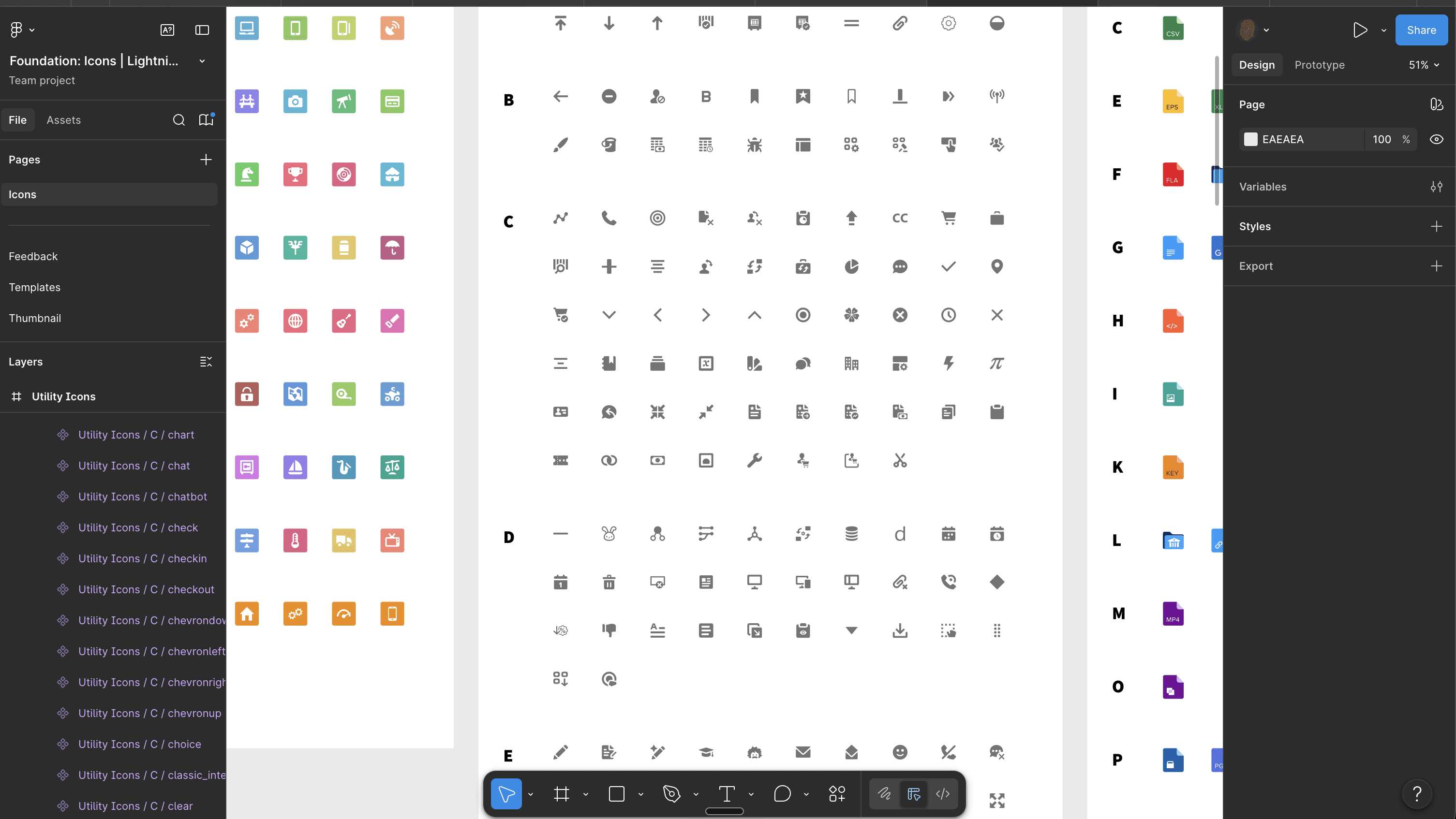
Icon Gallery
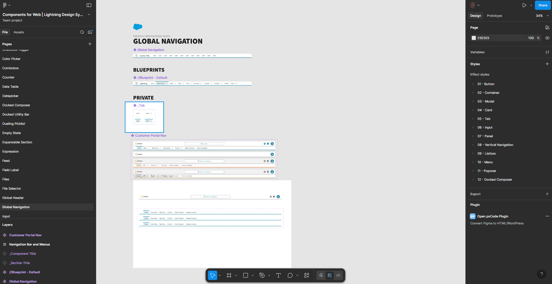
Creating Custom variants on top of Salesforce Lightning System
The software and tools used in the project is Figma
ACCESSIBILITY
Following best practice WCAG guidelines (meeting AA and AAA contrast requirements)
Deliver
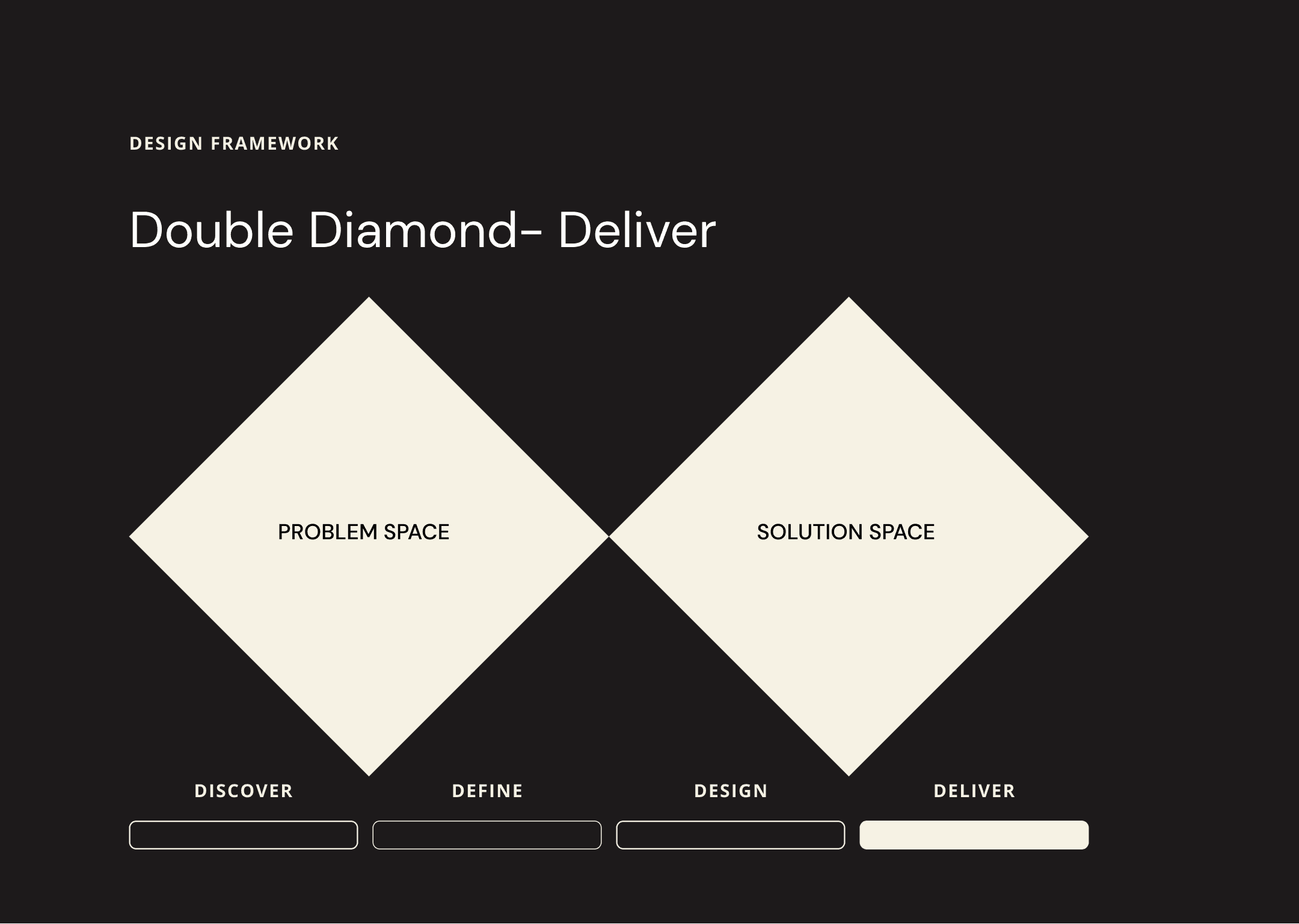
Hand over to the devs
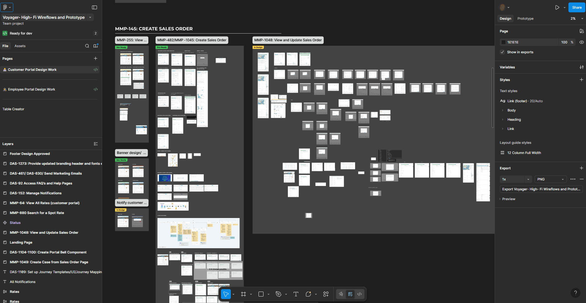
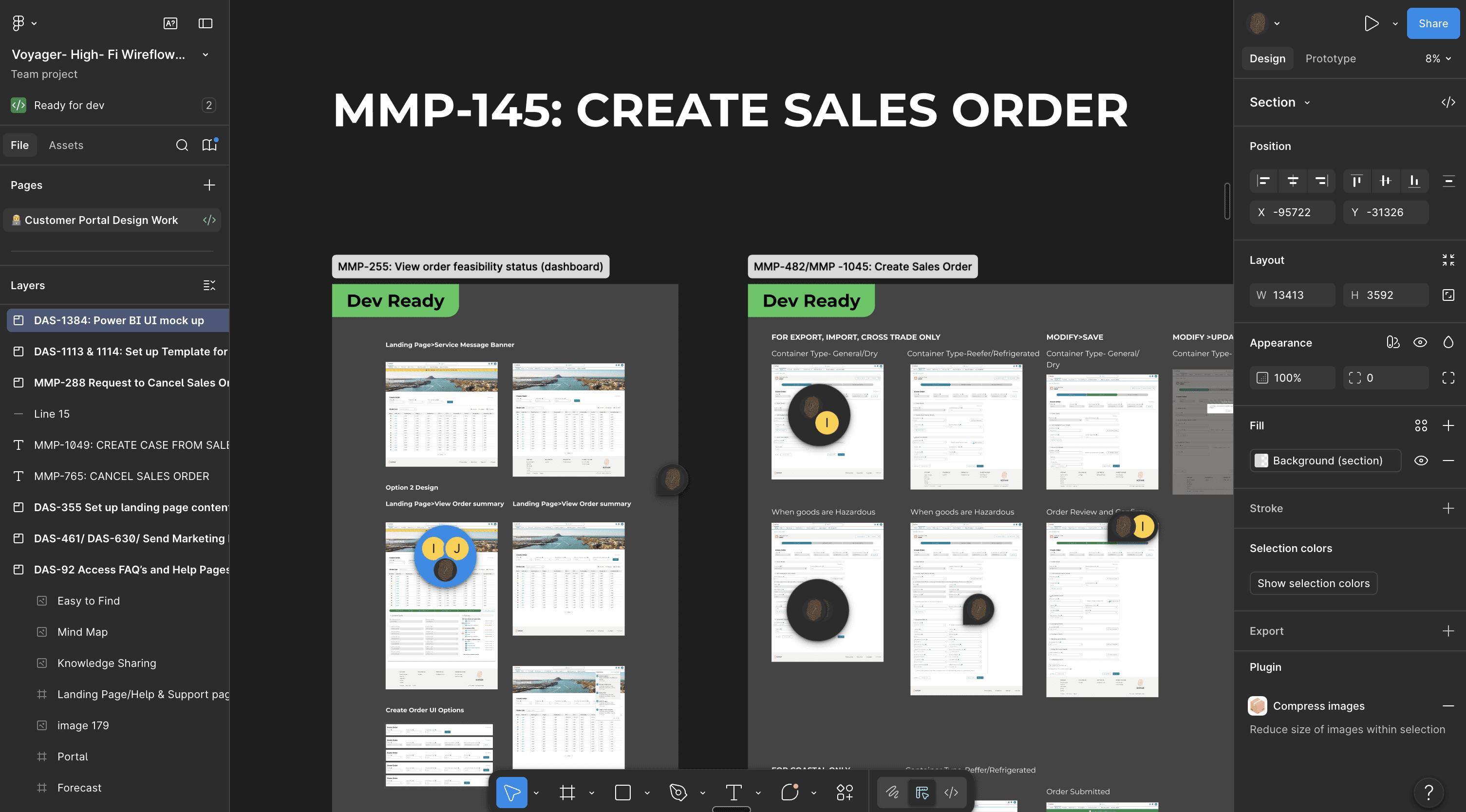
For best particle and execution the devs had access to the Figma files. I used tags to keep 'Design ready', 'In Review' and 'Dev Ready'. All the Frames were connected to the right Jira tickets so the PO and devs can access it.
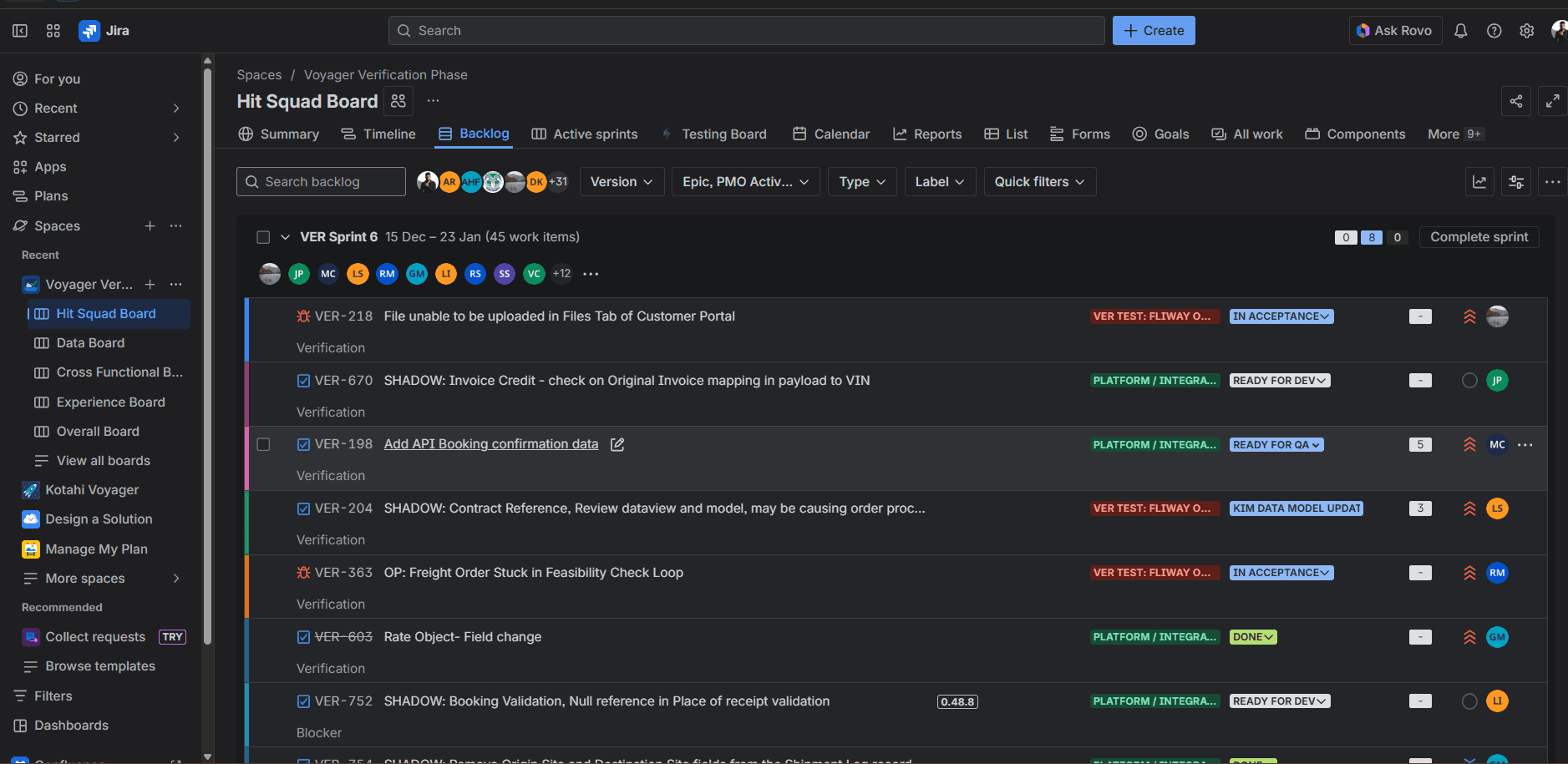
Jira board to track program progress
Thank you for reading!


